So colors on the first ish of Mega Man were stretched out almost over two months. Typically I get the black-and-white inks (B/W's) for a book at least four weeks before it goes to print. The ideal breakdown of my schedule would be 2 weeks for colors, 1 week for approvals, and 1 week for corrections/separations... But yeah, we've certainly had those crunches where we're pushin' that!
So at the start of Mega Man, Patrick was penciling and digital inking simultaneous to his pencil breakdowns on the "Genesis" storyline starting in Sonic the Hedgehog and all of his numerous covers for Sonic, Mega Man, Sonic Archives, etc that he often pencils, inks, and colors himself! With only about a month of lead time left before the Spring launch of the series, our editor Paul brought the talented Rick Bryant on board to handle the inking work. The new team assembled, we beamed on in!
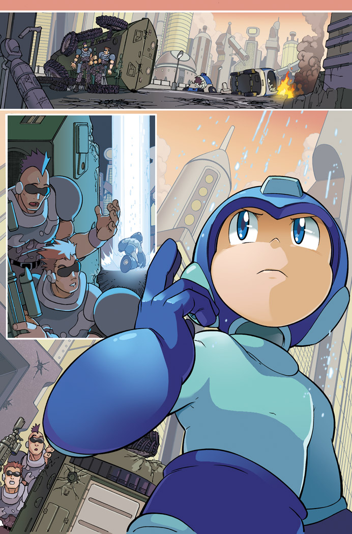

This opening shot features a couple of Capcom cameos, by the way: The Unknown Soliders from "Forgotten Worlds!" ...And I had no idea. Whoops! Patrick goes the extra mile to slip in Capcom Easter Eggs into the artwork - you might also notice that some of the Robot Master areas are modeled after stages from "Powered Up" or "Power Battle/Fighters." Bomb Man's here was inspired by "Powered Up."


Working on this first story arc - which is a tremendously faithful adaptation of the original NES game - introduced me to the unique challenge of color design based on 8-Bits. Mega Man teleports here-and-there every few pages so it's very important to communicate to the reader that we've changed locales. Thankfully, Patrick and Rick do much of the heavy lifting there. Mega Man pops off really well against warm colors, so we put the opening sequence into a sunset-y palette. Similar for Guts Man's "stage" - my favorite, in fact - with lots of browns and yellows and a gorgeously clear blue sky. And for Cutman we moved to a dusky, muted green inspired by his NES stage.

No comments:
Post a Comment