...Which, okay, is pretty much exactly like the finished product. With the "tabloid style" layout, nothing really got obscured this month by logo and numbering. So I thought I'd share with you guys some of the earlier "passes" and explain the process a bit.
So at the tail-end of every month, my editor will shoot me an e-Mail to let me know what covers are in the pipeline for me to color - some with fast turn-around (next two days) and others with plenty of time (next two weeks). I'll receive the inked black-and-white artwork in a couple of ways: Archie's inhouse team will scan the cover and send it to me over e-Mail/FTP, or they'll snail-mail me the original artwork to scan in myself. The former is always preferred to the latter - I have a standard format scanner, so I have to scan the artwork in two halves and "stitch" them back together in Photoshop.
.jpg)
.jpg)
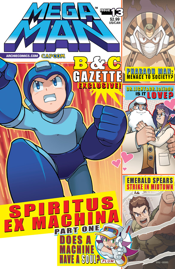
Middle: Second pass. It was felt that the orange background made the image too heavy and detracted from the magazine vibe. Some lettering was added/fixed: "Exclusive" was added in and Pharaoh Man was changed to two words... And the hearts around Light and Lalinde? Not a correction, just something I felt would add to the composition.
Right: The cover as it went to solicits. Not too much got changed here: Just some lettering and FX.
No comments:
Post a Comment